Improving a webpage:
http://christiancountymogop.com/
Change 1
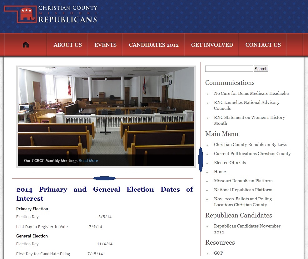
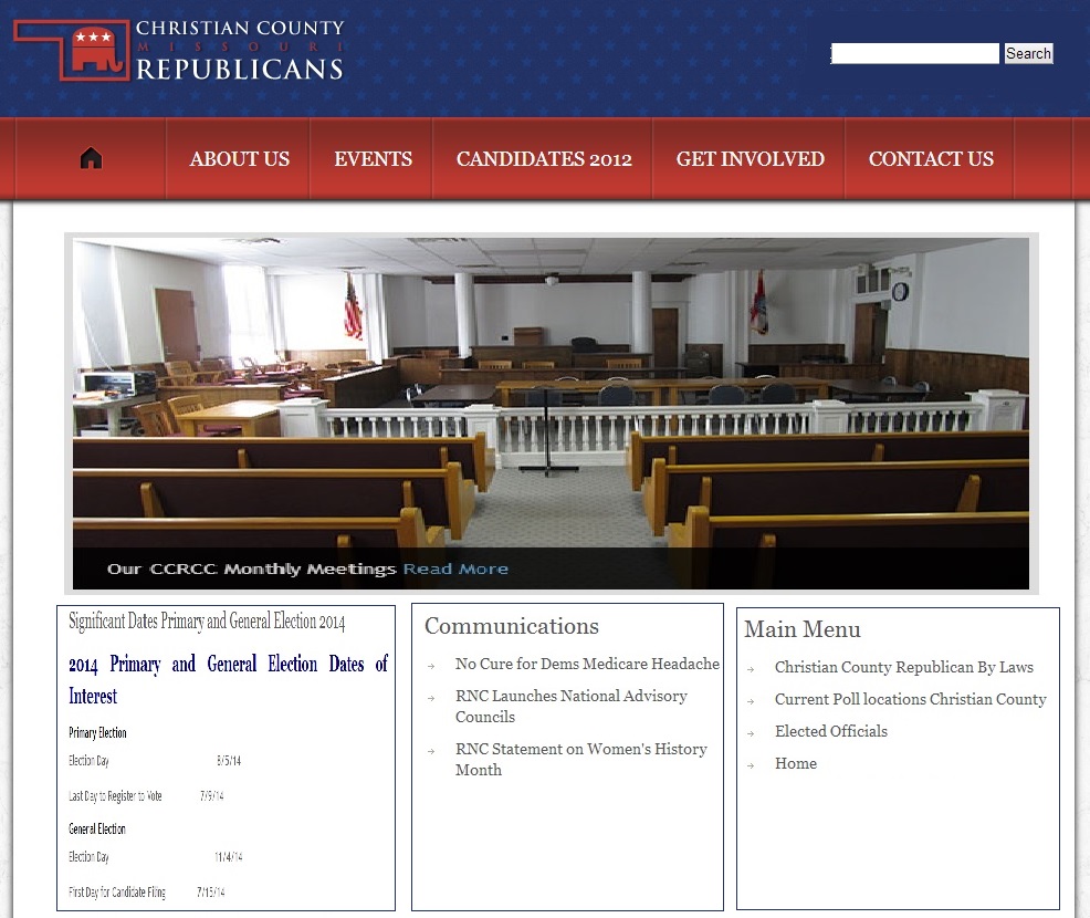
One of the most evident example of bad design in this webpage is the way the calendar is portrayed. The spacial proximity of the dates is not neat (aligned incorrectly), resulting in a break of the law of continuation, therefore confusing the user.
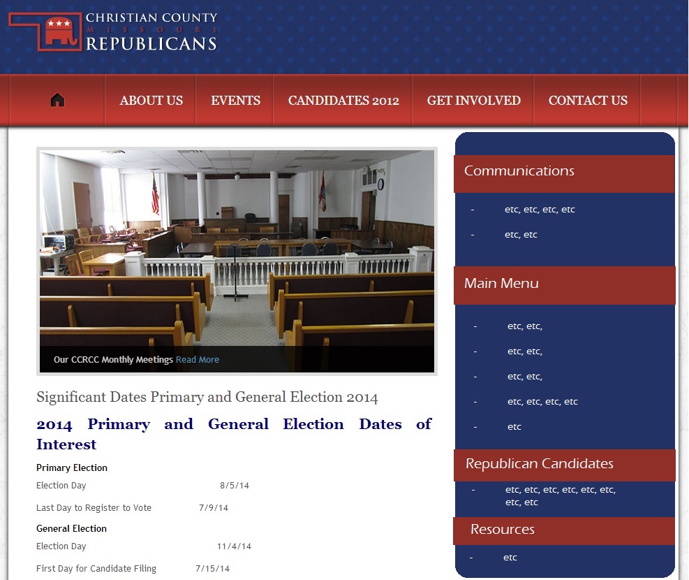
The image below solves the misalignment problem, resulting in a more clear understanding.

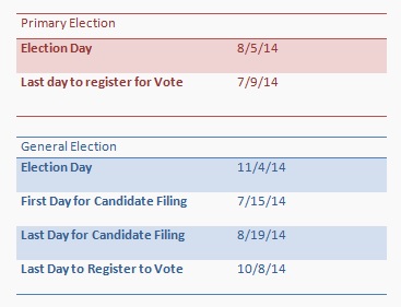
Change 2
The second change made to the calender is to add linking via colour space - as the law of proximity has already been solved, this is a simple matter of adding rows or columns of identifying background colour. This can be extended by using different colours to further differentiate between separate information.
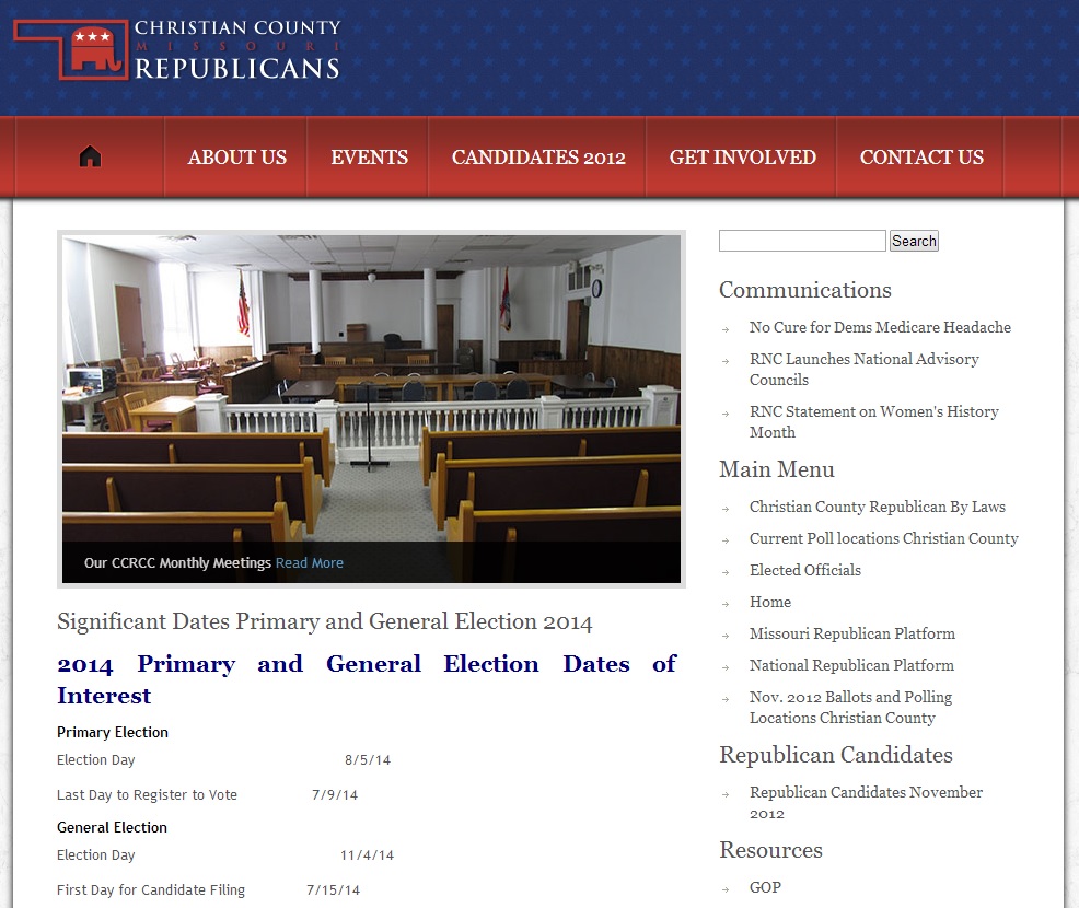
Change 3
This change rearranges the elements of the website for a more symmetrical layout, with one main featured picture followed by a grid of information.The search bar's position was also changed.
Change 4
Much like the calender, the menu information should also conform to grouping standards. In this example, they are redesigned to follow the same colour scheme as the header, but in a way that clearly seperates the different sections.
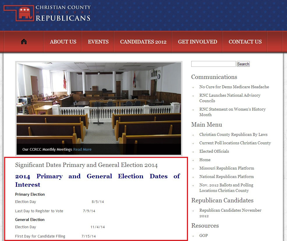
Change 5
However the site is layed out, I feel that it would be beneficial to have separation distinctions between different elements. These seperators only need to be subtle, as their existence implies a phase of motion that the user will then read the content in.