Downgrading a webpage:
http://eu.square-enix.com/en/home

Change 1
An obvious change that can be made to this website to make it worse is to break the law of continuation - as can be seen in the preview picture, this website is highly reliant on an organised grid formation to display the content. By moving elements, navigation and grouping is made more confusing.
Change 2
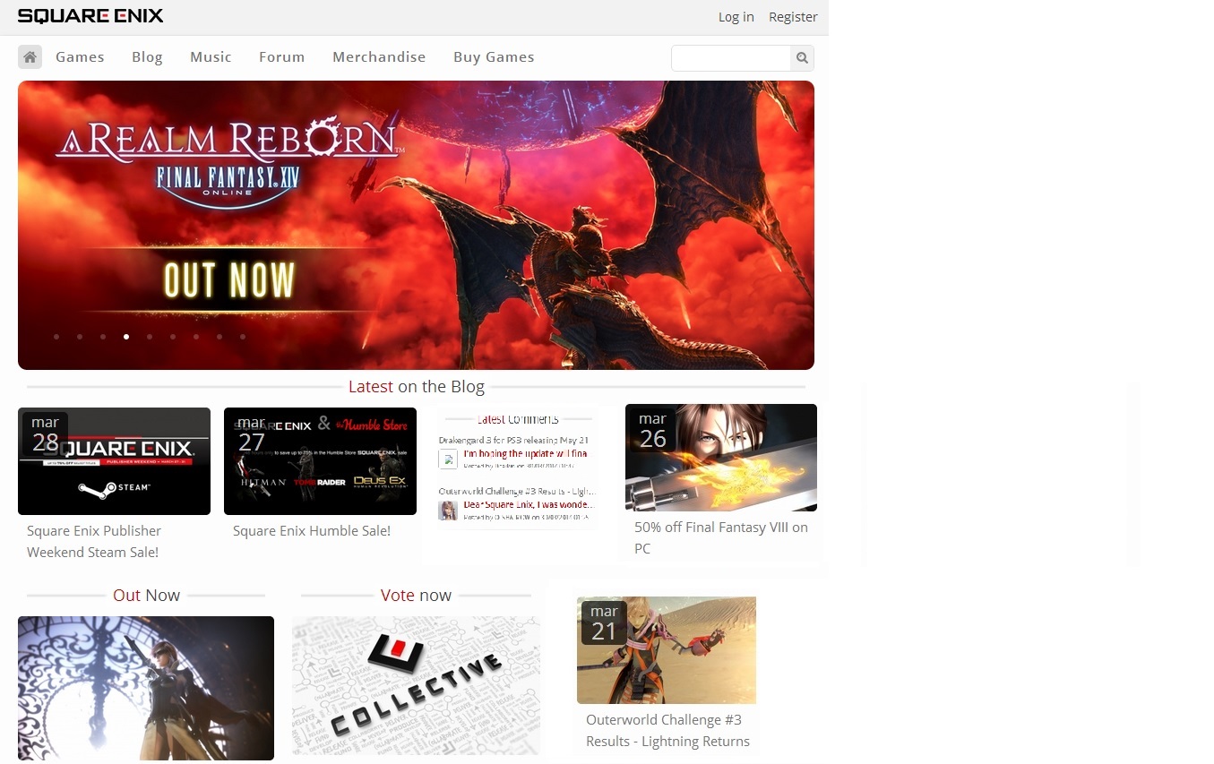
A change in grouping is done by switching one of the blog post positions with the 'comments' section, breaking the law of proximity.
Change 3
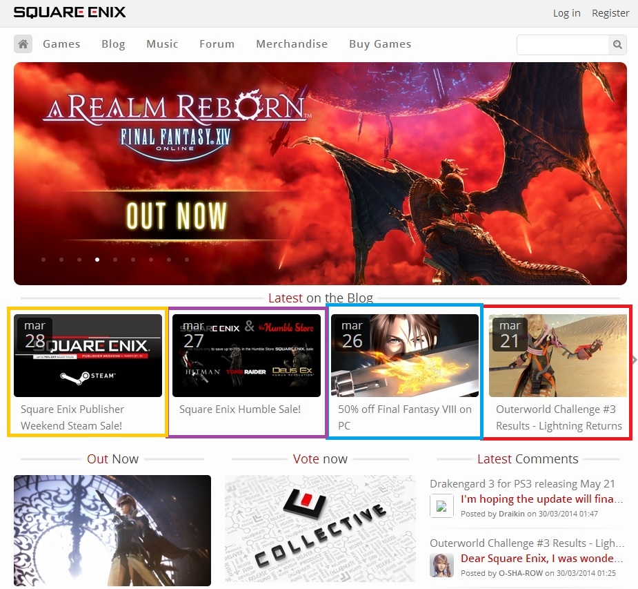
In this change, I decided to surround the blog posts with coloured boxes. While this may draw attention, according to the Law of Pragnanz, this is a break in simplicity. Adding unneeded complex shapes or colours to an object is an example of bad design.
Change 4
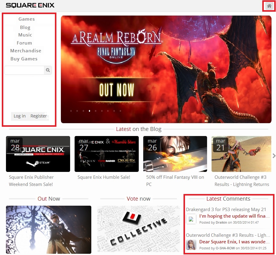
By modifying the text of the navigation bar at the top to a simple underlined format, I break the rules of figure and ground - while before the text worked as a figure, now it just seems like a needlessly complex and aesthetically displeasing set of links.

Change 5
This last step changes multiple things. First, the horizontal navigation bar is changed to a vertical bar on the left - this breaks the symmetry of the web page, and while it doesn't look that bad, will have a slight negative effect on viewing. Lastly, red boxes are place around the navigation bar, the home button on the top right, and the comments section. Viewers will now perceive these elements as sharing a common theme, which they do not.