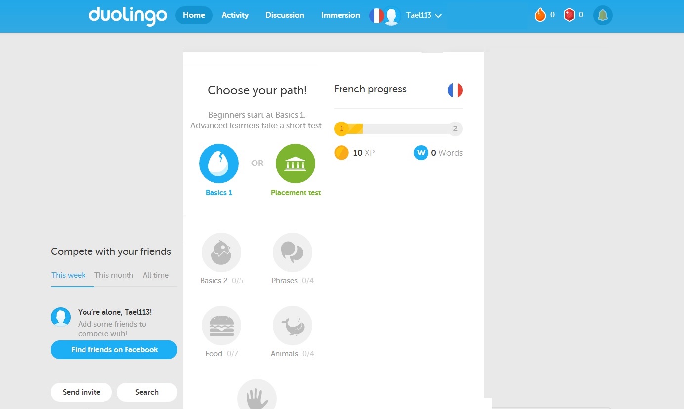
Downgrading a webpage:
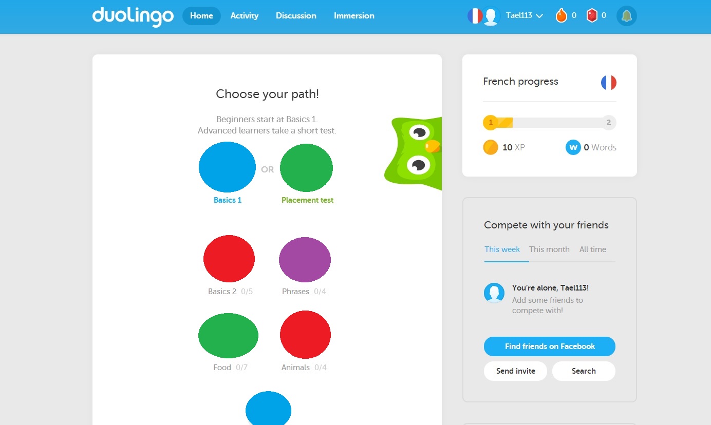
https://www.duolingo.com/
Change 1
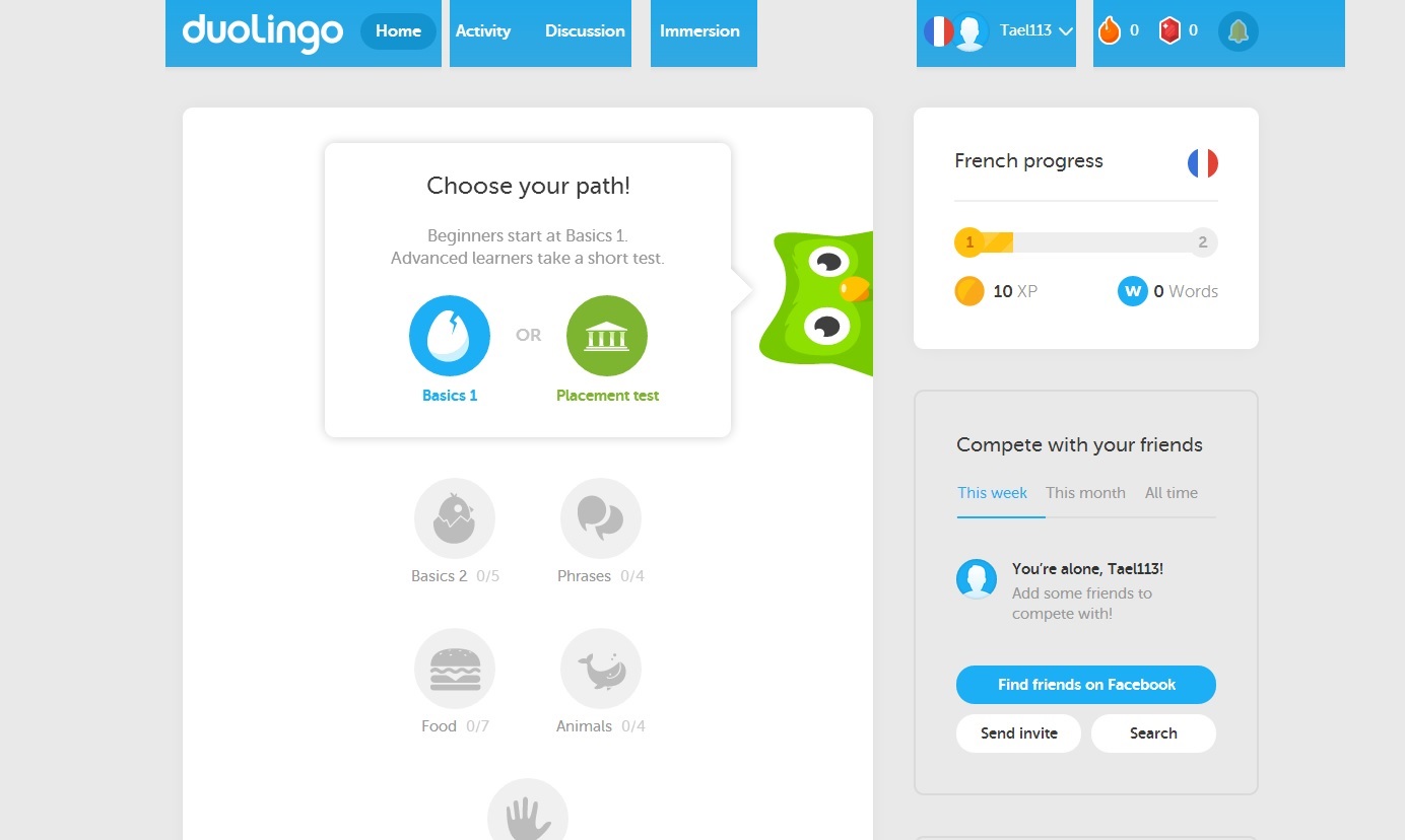
The first change made to this website to make it harder to use is the removal of the ground colour, which in turn makes the figure elements less pronounced.
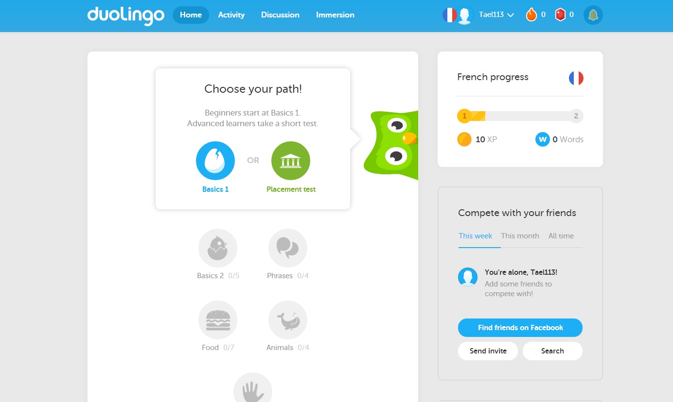
Change 2
Another change we can add is to misalign the grid pattern that builds the main features of the site. This breaks the law of continuation, making the individual elements harder to understand.
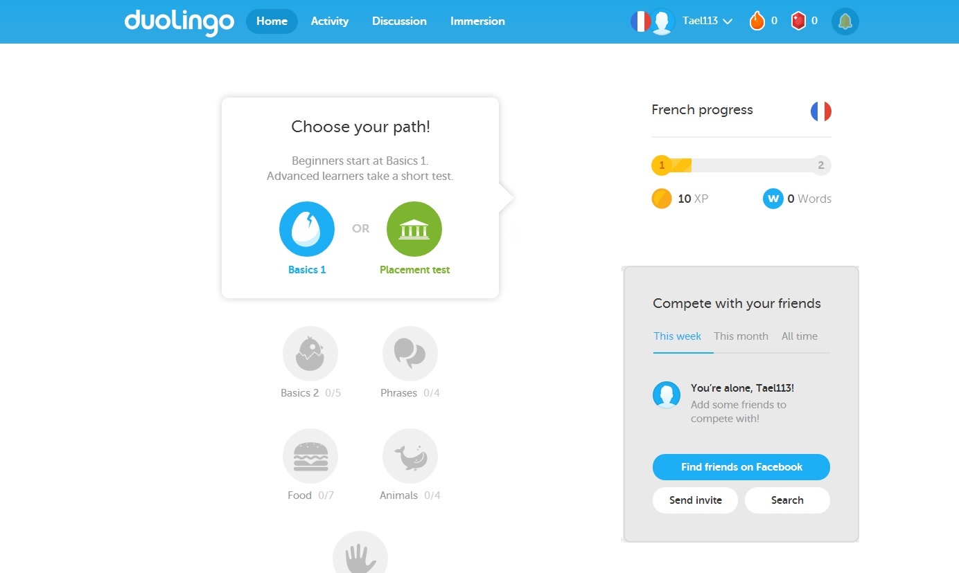
Change 3
In the main element, the valid options are visually obvious due to colouring, with the unavailable options in greyscale. If all options were coloured, or all were greyscale, this would eliminate that advantage.
Change 4
The law of continuation is also in effect at the top of the page, with the unbroken bar indicating similar functions. If the bar is broken, this indication is lost.
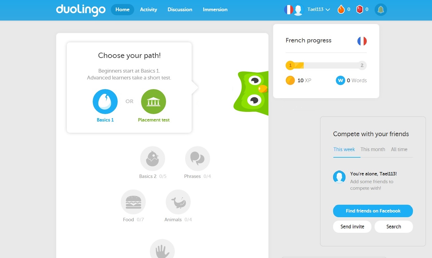
Change 5
Lastly, by changing the proximity of elements to be closer to one another, the definition of seperation is weakened. In this example, I moved the account button closer to the navigation area on the top bar, and and moved the main elements closer together.