Improving a webpage:
http://www.coolstuffinc.com/
Change 1
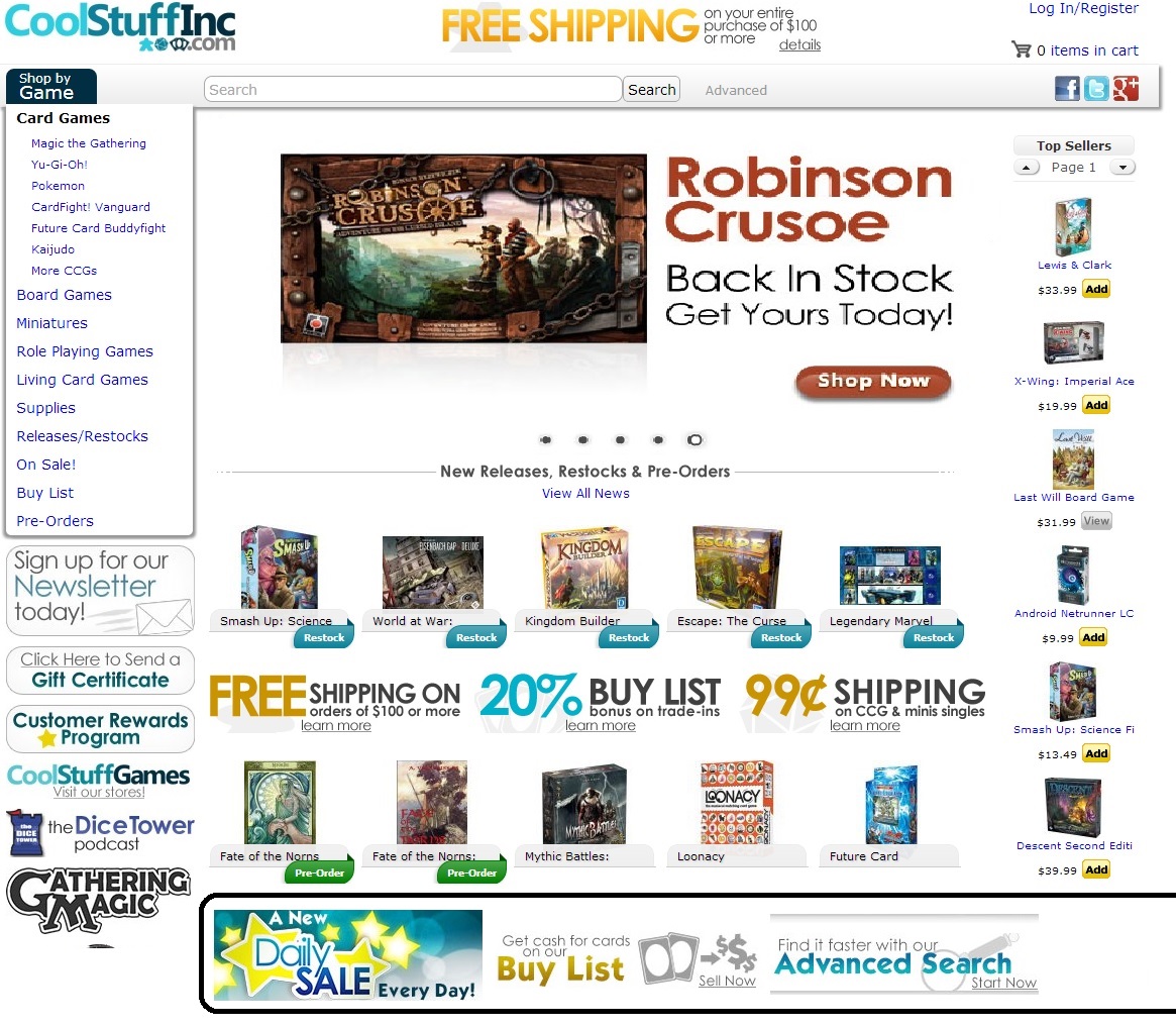
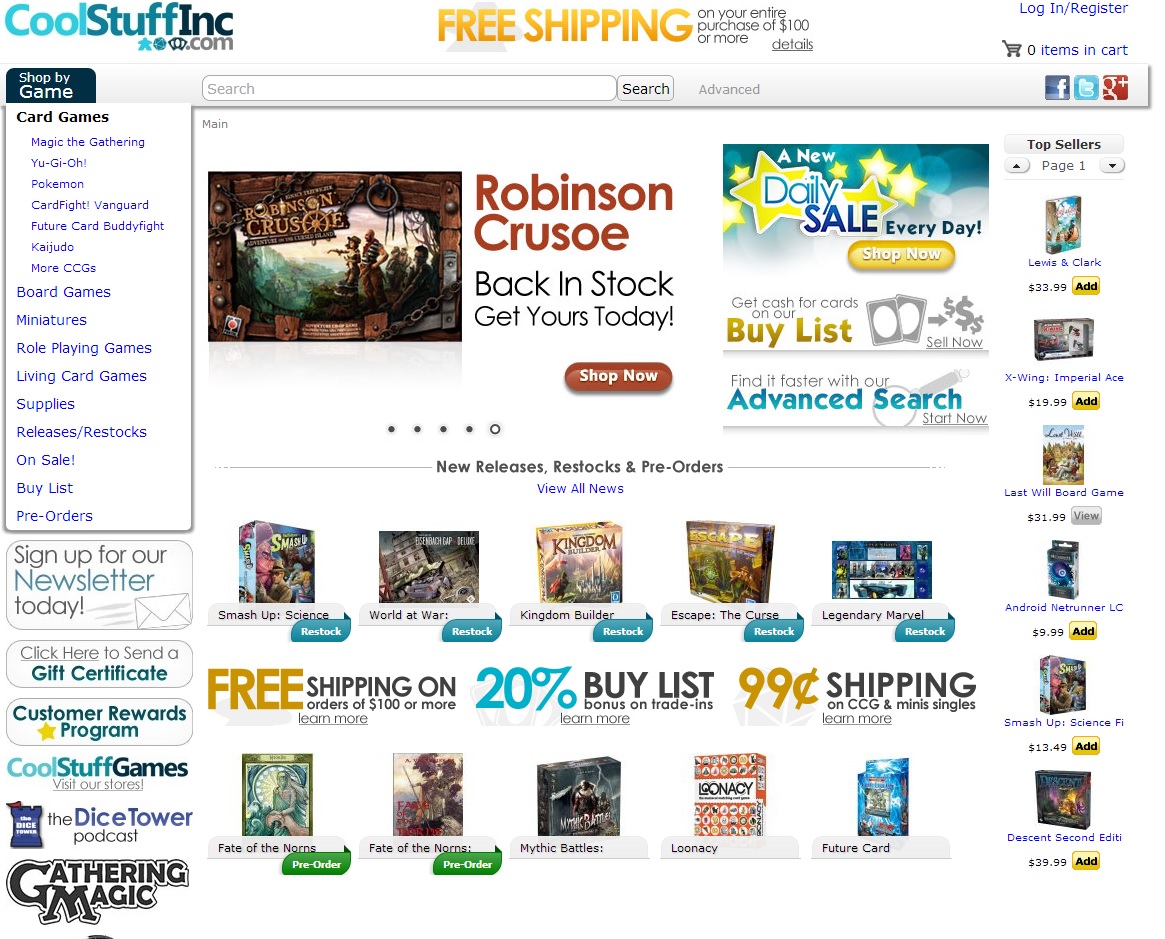
The first problem I see with this website is the flow between relevant information. the would-be grid of items on the bottom is split up by a bar of offers that does not conform to the grid structure, breaking the law of proximity the sets of items would otherwise have. To fix this, I simply rearrange the bars.

Change 2
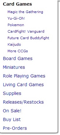
The second change I make to improve this website is to the navigation bar on the left. Making the text the clear figure against a ground would be more appealing than the simple coloured text surrounded by a box.

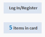
Change 3
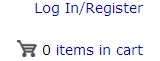
The third change is to the top right - the Log In area. These buttons do not stand out enough on the white background, and the Law of Similarity would give them a defining feature to make the function more easily recognizable.
Change 4
The fourth change is to the right area - the 'Top Sellers' part of the page. This list of items currently does very little to distinguish it from the normal list of items and, by extension, causes confusion and breaks up the structure of the page, as customers do not easily separate it from other elements. To fix this, there are multiple options - I have simply gone for adding surrounding boxes, but colour and highlighting are also options.

Change 5
The last thing I would change is the placement of the 'Daily Sale' and 'Advanced Search' advertisements in the main, center area. As it is, this placement draws attention from the scrolling item pages to the left, even implying by the law of separation that they are to be grouped (which is incorrect). A more elegant solution is to move this advertisement down to the bottom.